
 Hello again,
here are two backlogs I did. The first one is an inital I found in a book containing only medieval intitals, some of you might have had a look into it if they were at the scriptorium at university last weekend.
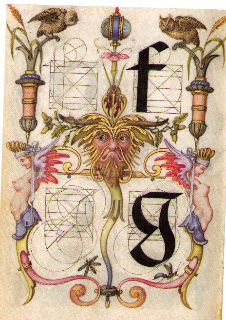
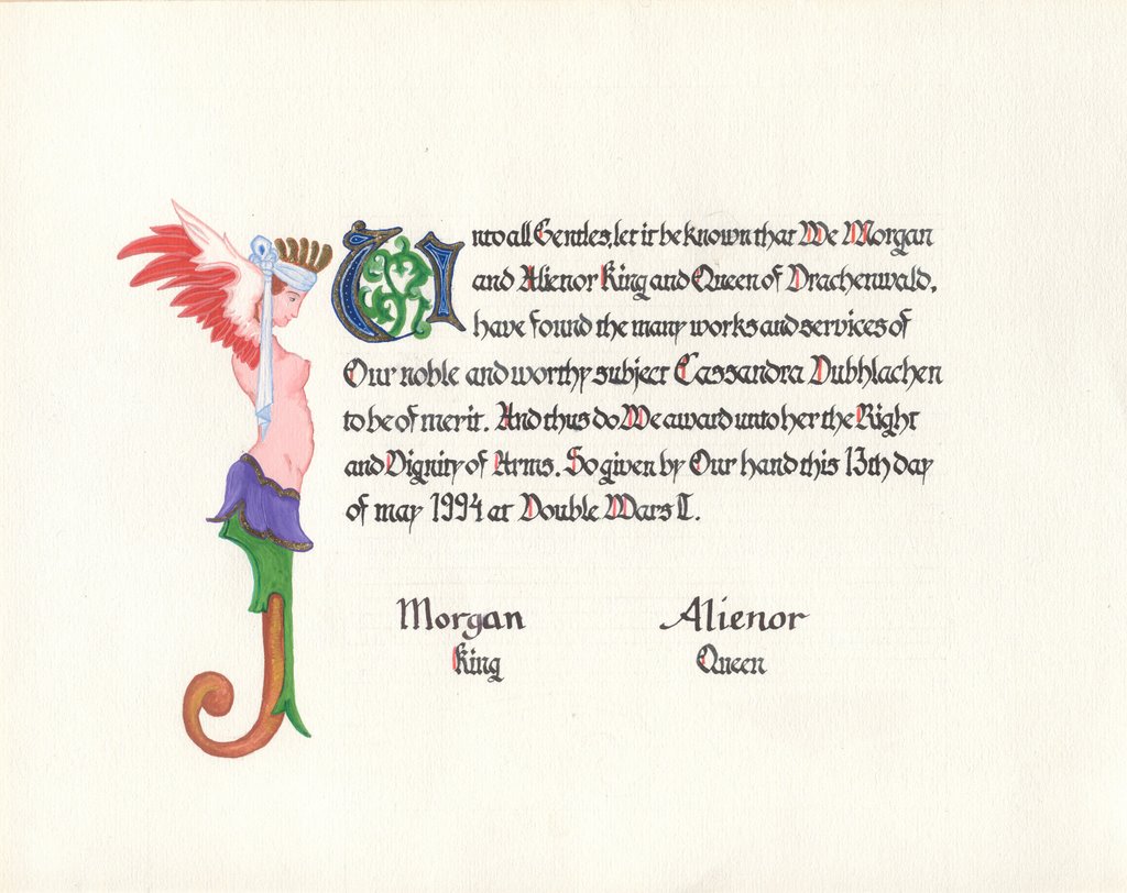
The nacked chick for the other one I got from the book " Meisterwerke im J. Paul Getty Museum"- illuminated manuscripts. It is a page from the Mira calligraphiae monumenta, Wien 1592-1596! I scaned in the original as well for you to compare.
What do you think? Any suggestions on the calligrphy or illunimation?


3 comments:
WAU! I love it :)
ooh, I really like your calligraphy. It looks so even and nice. Well done!
I do miss a few little details on the first scroll - whitework. The acanthus is great, you've got the shapes down perfectly and the scrolling and all of that, but when I looked at it it seemed to be a bit flat. It took me a moment to realize what was missing.
Still quite jealous of your calligraphy hand there. If I only had the patience for practice...
Looks really elegant! :)
Post a Comment